How effective is the combination of your main product and ancillary texts?
Bloody Mary is the media icon as she features in poster, mag and trailer. This is because we chose to use her in most of the teaser trailer shots and almost all the shots with her in featured some type of effect which made her stand out. This portrays a classic iconography of a westernized yuri which is shown in each media product. The font that we chose has become iconic to our teaser trailer because it also features in our magazine front cover as well as out teaser trailer itself.
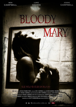
In our poster we chose to have only Bloody Mary as she is the most iconic image of our teaser trailer. She is centered in the poster, to show that she is the main character in our teaser trailer, not being able to see her face does not make it clear which role she is playing in the film. We chose to degrade the edges of the poster to make it look faded, whilst creating cracks to show that it is based on an old and mysterious legend. By doing this we hope to be able to draw in the audience by appealing to their curiosity as the poster does not give much away about the film, who is the victim and who is the killer along with who we will be following throughout the film, the story of how Bloody Mary came to be alive again, or what happens to the patient now that he has become overwhelmed with this psychotic breakdown.
In our poster we chose to have only Bloody Mary as she is the most iconic image of our teaser trailer. She is centered in the poster, to show that she is the main character in our teaser trailer, not being able to see her face does not make it clear which role she is playing in the film. We chose to degrade the edges of the poster to make it look faded, whilst creating cracks to show that it is based on an old and mysterious legend. By doing this we hope to be able to draw in the audience by appealing to their curiosity as the poster does not give much away about the film, who is the victim and who is the killer along with who we will be following throughout the film, the story of how Bloody Mary came to be alive again, or what happens to the patient now that he has become overwhelmed with this psychotic breakdown.
|
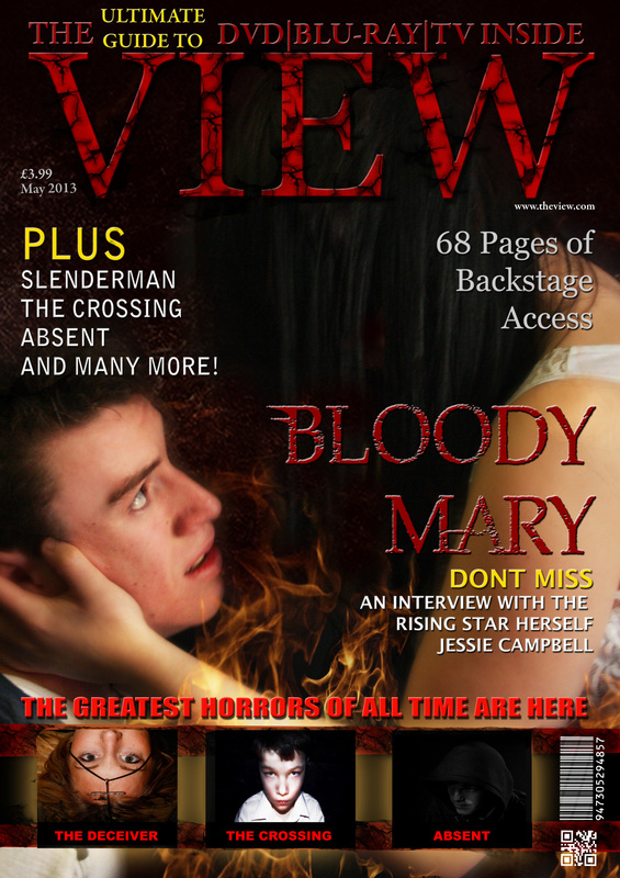
In our magazine we had Bloody Mary holding the patients head to show that he is under her control, this also shows that Bloody Mary is in the position of power. Bloody Mary is positioned higher than the victim and this shows dominance over victim. Both the patient and Bloody Mary are dressed in white, we did this so that the audience do not know who is the victim and who is the killer.
We wanted to keep the same font throughout the magazine and poster, this is because we wanted the viewer to see the font as a brand icon and know as soon as they see it that it's something to do with Bloody Mary. We chose to do this because other movies such as the Harry Potter series used the same font throughout and now that title is iconic of that series of films. With the victim in this poster we chose to make him almost have no pupil in shot so that he looks more insane. This will hopefully convey to the audience that he is not just the victim in the film. |
|
|
|
Throughout this teaser we wanted to have Bloody Mary being the main feature until the end where the patient goes mad and attacks the doctor. This works well with our other ancillary texts because in the poster and the magazine Bloody Mary is the more dominant feature, especially because in the poster it is only a shot of Bloody Mary. In the teaser we wanted to incorporate fire to show how fragile the patient is and how consuming Bloody Mary can be when she finds a victim.
In this teaser trailer we wanted to play with audiences expectations a lot. The poster and magazine really help with this because they focus on Bloody Mary, and by doing this it makes the twist ending where the patient attacks the doctor so much better. Although the magazine does have the patient in it, Bloody Mary is the obvious and dominant character, because of her higher position on the magazine and then fact that it looks like she is controlling the patient. In this teaser trailer we took many shots throughout of eyes, Bloody Mary's and the patients, this was to try and confuse the viewer about who's perspective we are seeing, therefore drawing the audience in. |
|
These next two buttons are out poster and magazine in puzzle form, this shows how each aspect of our magazine and poster form a much bigger and effective advertisement. Each aspect of the poster and magazine are important because without you would lose out on important information about the film.
|

